3D Sculpting

New Website, New Logo, New Business Cards

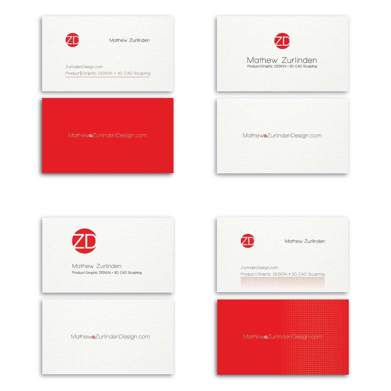
With a new website and a new logo, it was only appropriate to design new business cards.  My personal design aesthetic preference is clean and simple but I wanted to explore a variety of options before committing on a design.  I ended up creating 12 unique designs; below is the final four designs I debated between:

business-card-design

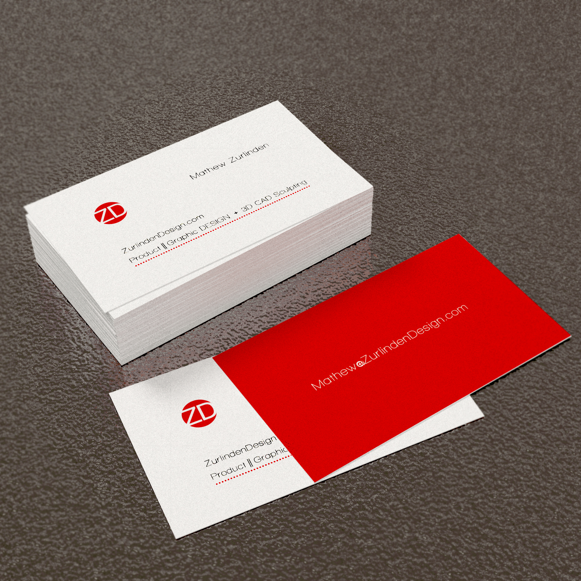
After making my final decision I did the only logical thing; I made a 3D CAD model to see what the final printed cards would look like… This also afforded me an opportunity to easily test the remaining designs and confirm my decision.  Below is my final decision in the 3D environment

business-cards-rendering


April 2, 2014

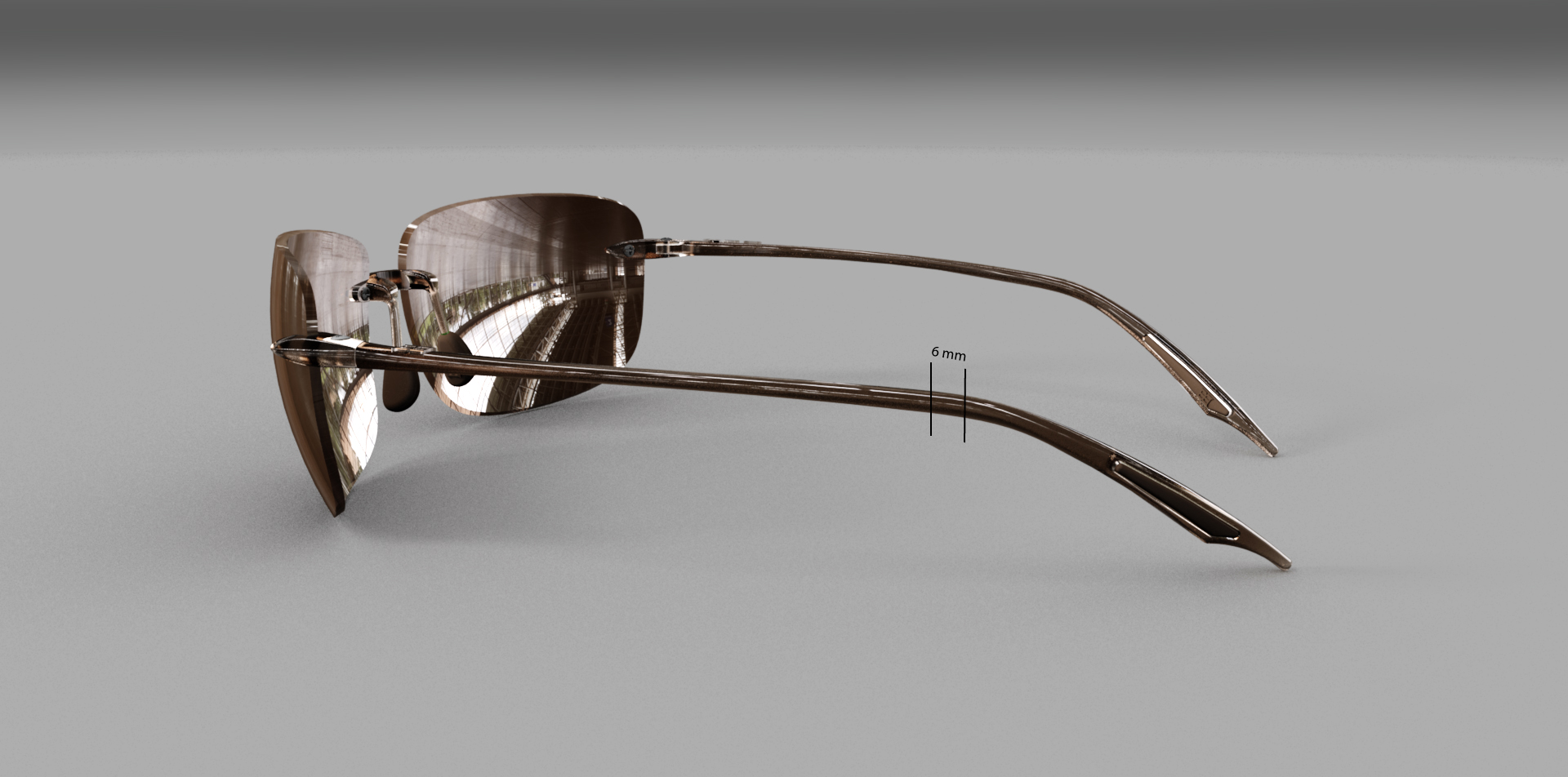
We don’t always get it right the first time…

sunglasses-temple-design

Fortunately, with 3D printing we can easily determine how a design can be improved before it is sent for tooling.  In this case, after the prototype was created and tested we determined the design would be improved if we removed 6mm from the length of the temples.  6mm might sound like a minimal amount to invest energy into; but it is usually a collection of small details that make a product great.  I am always happy to make a small change to make a big difference.

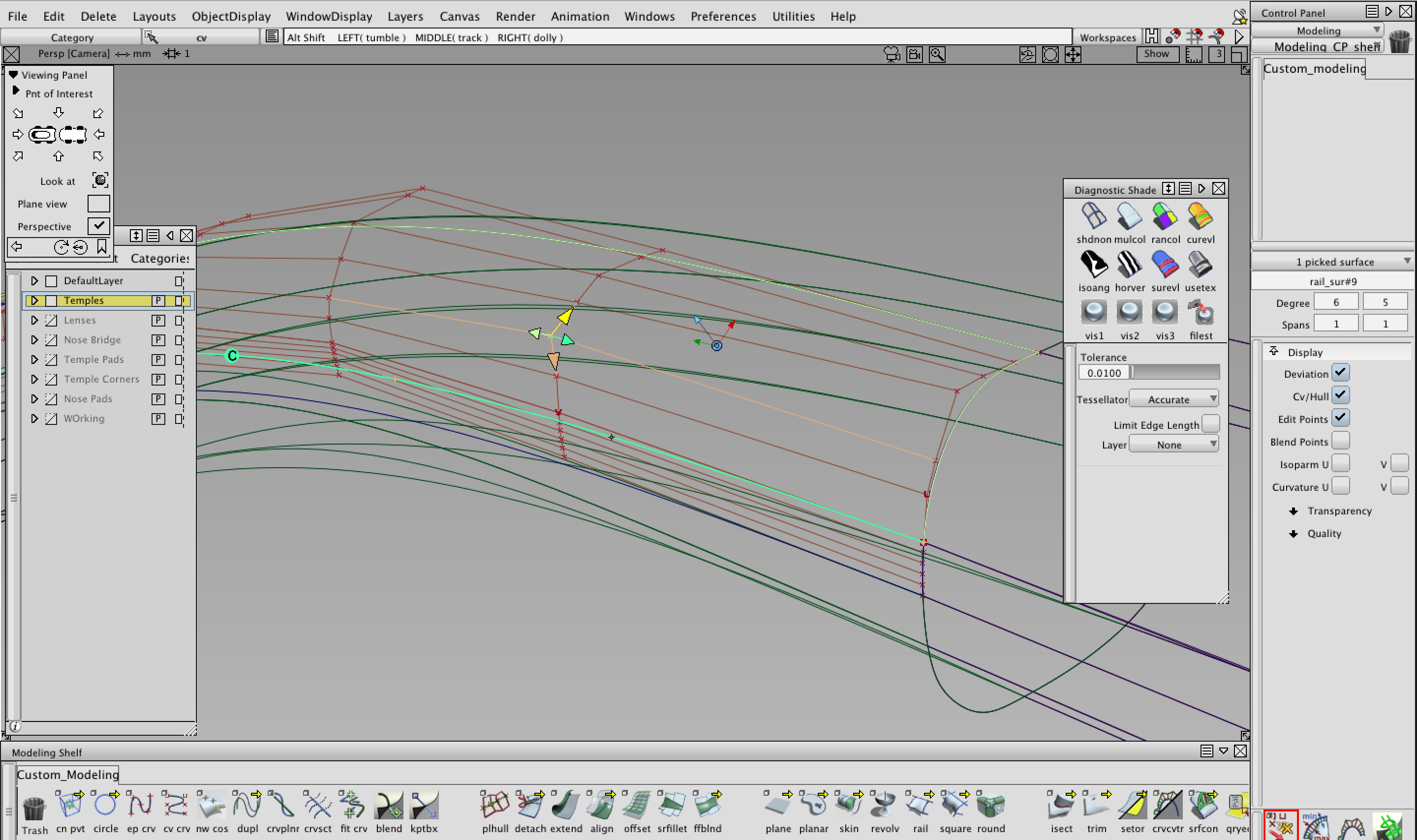
A 6mm change can sometimes mean a significant amount of work.  In this case, the change was simple but required a lot of work to maintain continuity between surfaces.  So, to improve the design, I spent my day pushing and pulling CVs.

alias-design-autodesk


March 29, 2014